Logos and graphic identity
Here you will find our logos, colours and guidelines for how our brand should be used in external and internal contexts. The material is available for the press, partners and others who need to communicate MP bolagen in a correct and consistent manner.
Consistent use of the logo and colours is important to ensure recognition and clarity in our communication.
Logos
Our logos are available in several formats and variations for different applications, both digital (PNG) and in print (EPS).
Usage Guidelines
To ensure a uniform expression, the following applies:
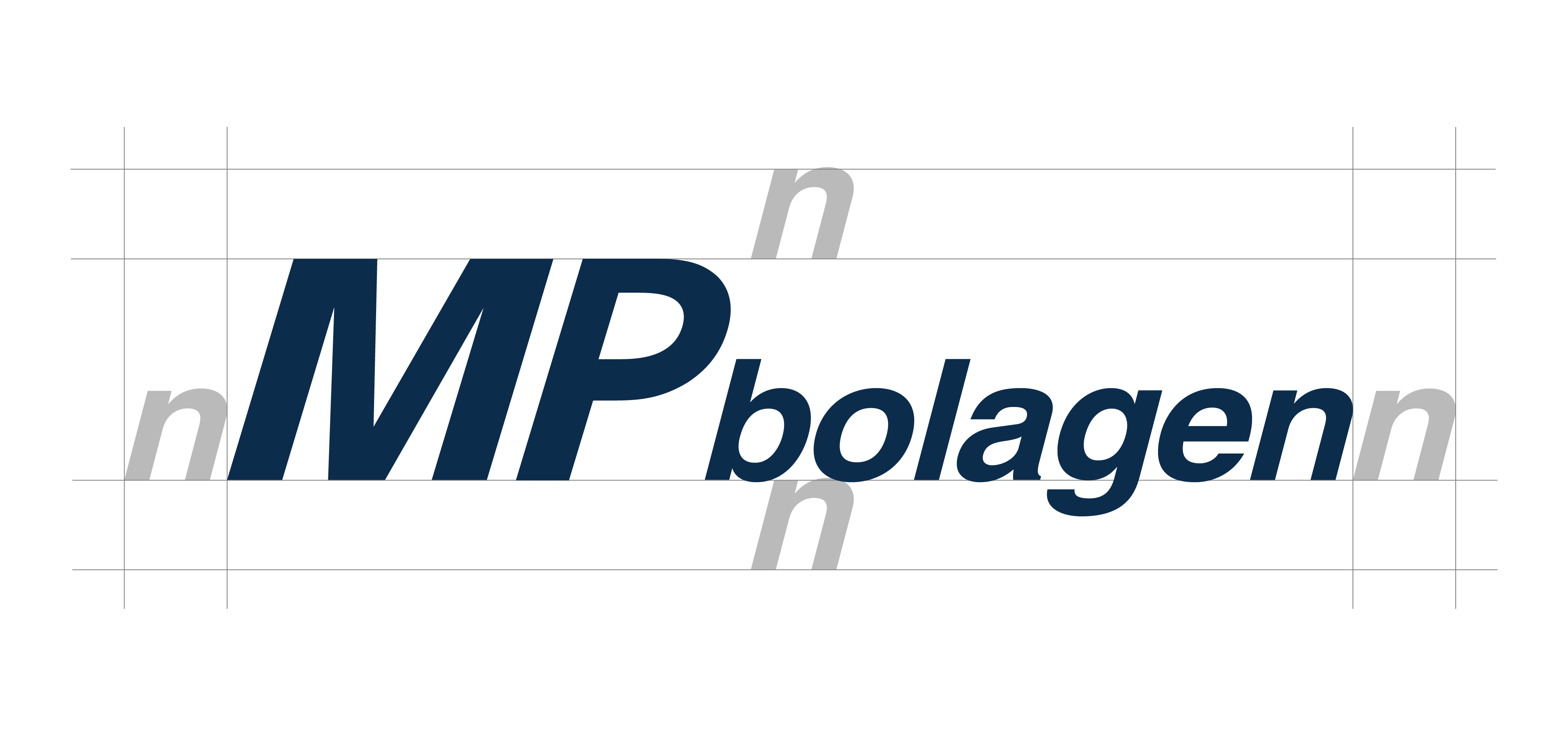
The logo must always be reproduced in correct proportions.
Do not change colours, shapes, or typography.
Do not add effects such as shadows, outlines, or transparency.
Ensure that the logo always has sufficient clear space around it.
Place the logo against a background that provides good contrast and readability.
If in doubt, choose a simpler and clearer usage. For questions, contact marknad@mpbolagen.se

Blue logo

White logo
Colours
Our brand colours are an important part of the visual expression and should be used consistently in all communication.
Here are our primary colours with associated colour codes for:
RGB and HEX (digital use)
CMYK (print)
The colours should not be toned, adjusted, or replaced with nearby shades without approval.
Dark blue
CMYK: 100, 57, 12, 66
RGB: 0, 48, 87
HEX: #003057
The profile colour should always take precedence over other colours and be used consistently to ensure recognition.
Light blue
CMYK: 40, 0, 10, 0
RGB: 163, 216, 231
HEX: #a3d8e7
The light blue is a supporting colour used to complement the profile colour, for example in graphical details where variation is needed, but should never dominate or replace the dark blue.
Grey
CMYK: 0,0,0,25
RGB: 191, 191, 191
HEX: #bfbfbf
Grey should not be used to signal brand but to support layout and content.